The beauty brand packaging design system.
A design system is what makes a line of SKUs read as one brand. Not seven packaging decisions, not three agencies, not whichever supplier won the last RFP. This guide is how we build the system that scales from a hero SKU through line extensions, holiday sets, and PR formats — without rebuilding the brand every time a new product ships.
What is a beauty brand packaging design system?
A beauty brand packaging design system is a documented set of structural, visual, and material rules that lets a brand scale across many SKUs while reading as one. It fixes what cannot change (silhouette, hierarchy, finish stack, typography), defines what can flex (color, secondary architecture, seasonal variants), and lives as a written specification maintained by one owner. The point is not to constrain creative — it is to make the next SKU, gift set, or PR mailer easier to launch than the last.
What to know
- A system is defined before the second SKU, not retrofitted after the fifth.
- Fix the silhouette, hierarchy, and finish stack; let color and secondary architecture flex.
- A single owner enforces the specification across every supplier and every launch.
- The system pays off at line extensions, gift sets, and PR formats — not at the hero launch.
01.Why a packaging design system matters
Most beauty brands launch with one SKU, one agency, and one supplier. The pack looks great. Then the second SKU arrives — a slightly different format, a slightly different timeline, and a slightly different approach to the brand — and the system starts to drift. By SKU five, the line looks like five brands sharing a logo.
The Luxury Beauty Packaging System guide covers how to make one SKU premium. This guide covers the next question: how do you make a line of SKUs premium, consistent, and operationally manageable — across hero launches, line extensions, holiday sets, and PR formats — without rebuilding the brand each time?
That question has three answers: a written system, a disciplined roster of suppliers that can hold it, and one accountable owner. The sections below are the operating manual.
- The seven system layers that make a line read as one brand
- A scroll-through tour of a working system across a multi-SKU family
- How a system scales from hero SKU to line extension to holiday set to PR
- The rules that fix — and the rules that flex
- Supplier and specification requirements for cross-SKU consistency
- A 10-item design system readiness scorecard
02.The seven system layers
Every effective beauty packaging design system has the same seven layers. They are not optional. A brand that defines six of seven ships a system that drifts on the seventh.
| Layer | What it does | Fix or flex |
|---|---|---|
| Silhouette | The anchor form that every SKU inherits | Fixed |
| Hierarchy | Dimensional relationships that signal hero vs. support vs. extension | Fixed |
| Finish stack | Soft-touch, foil, spot UV, deboss, emboss — ordered and placed | Fixed |
| Color system | Palette with assignment logic for hero, variant, and seasonal | Flex within rules |
| Secondary architecture | Modular carton, tray, and insert construction | Flex within rules |
| Typography & lockup | Brand mark, SKU name treatment, and legal type placement | Fixed |
| Supplier roster | The factories and vendors that can hold the system | Fixed by capability |
03.How the system scales — a scroll-through tour
This is what a working beauty packaging design system looks like as it moves from the family overview to the shelf. Scroll through the seven layers. The pack on the left is the system’s state at each layer. The copy on the right is what the layer is doing.
A line is not a logo on seven packs.
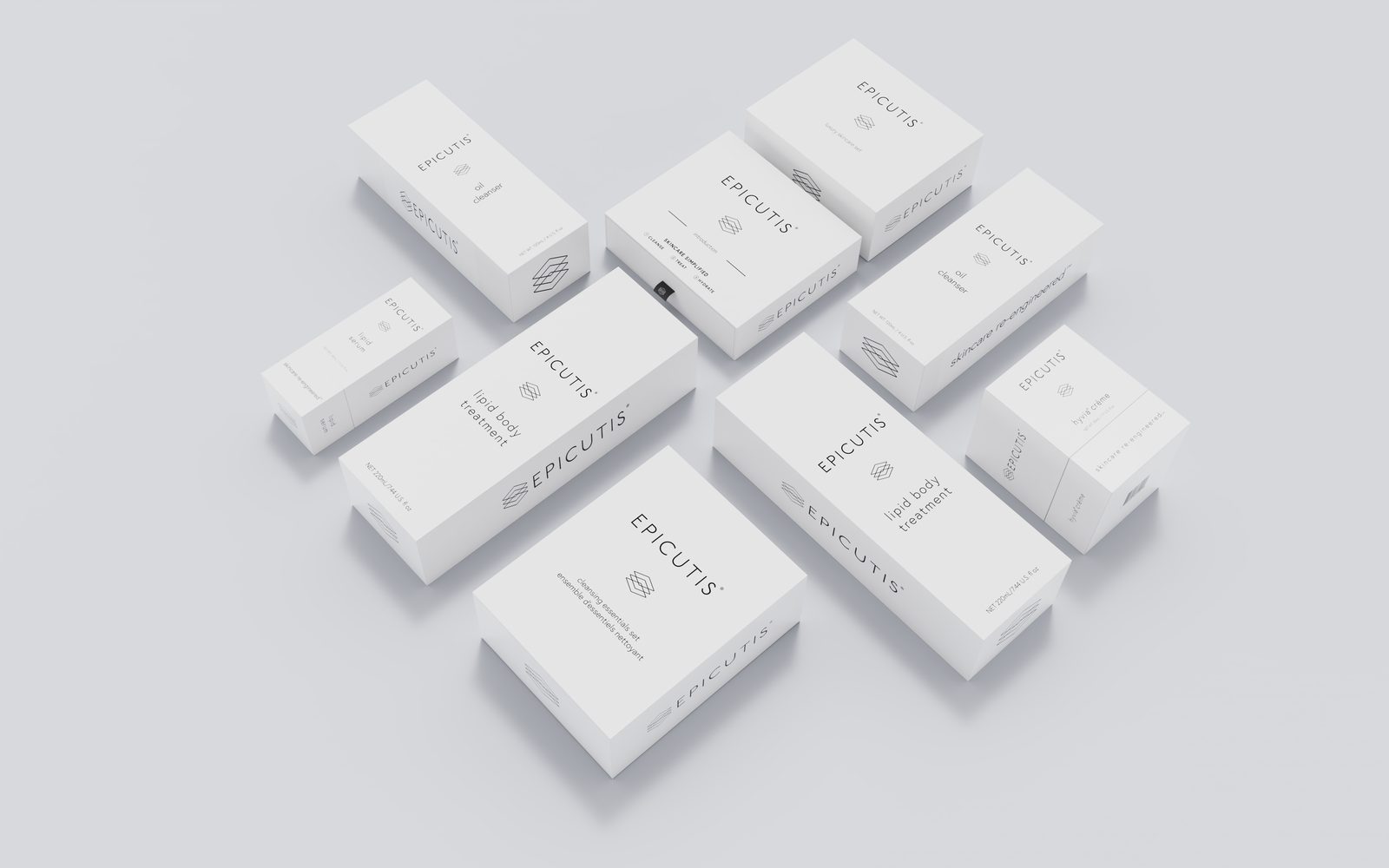
The brand you remember is the one whose seventh SKU reads like it belongs to the first. That recognition is a system decision, made before any individual pack is designed. The system is what makes the brand expandable.
- A line of seven unrelated SKUs reads as inconsistent, not premium.
- A line of seven SKUs that share one system reads as considered — even at a glance.
The silhouette is the first decision — and the hardest to undo.
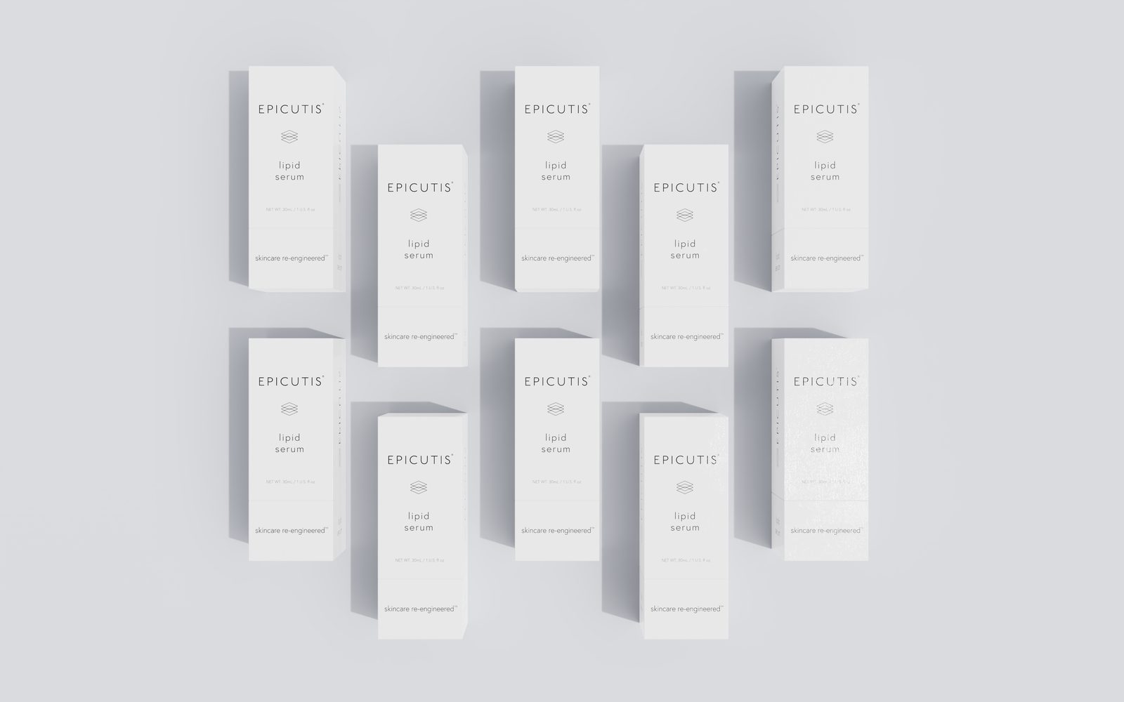
Every pack that follows is designed to belong to the silhouette. Change the silhouette on SKU five and SKU one looks like a different brand. The silhouette is the system’s anchor — it carries more identity than color, type, or finish.
- Document proportions, radii, shoulder heights, and anchor points.
- Specify how custom silhouettes are extended — taller, wider, same family — before the second SKU briefs.
- Confirm the silhouette can be sampled consistently across the supplier roster.
Dimensional hierarchy signals the hero without the label.
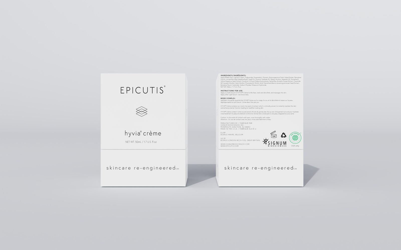
Height, proportion, and tray position do more identity work than most brands expect. A reader should know which SKU anchors the line and which supports it without reading the name. Hierarchy is how the system scales legibility.
- Hero SKUs lead on height or proportion — the tallest or widest form.
- Line extensions share the silhouette at a scaled or truncated proportion.
- Gift and seasonal sets position the hero at the center or front of the tray.
The finish stack is the system’s signature.
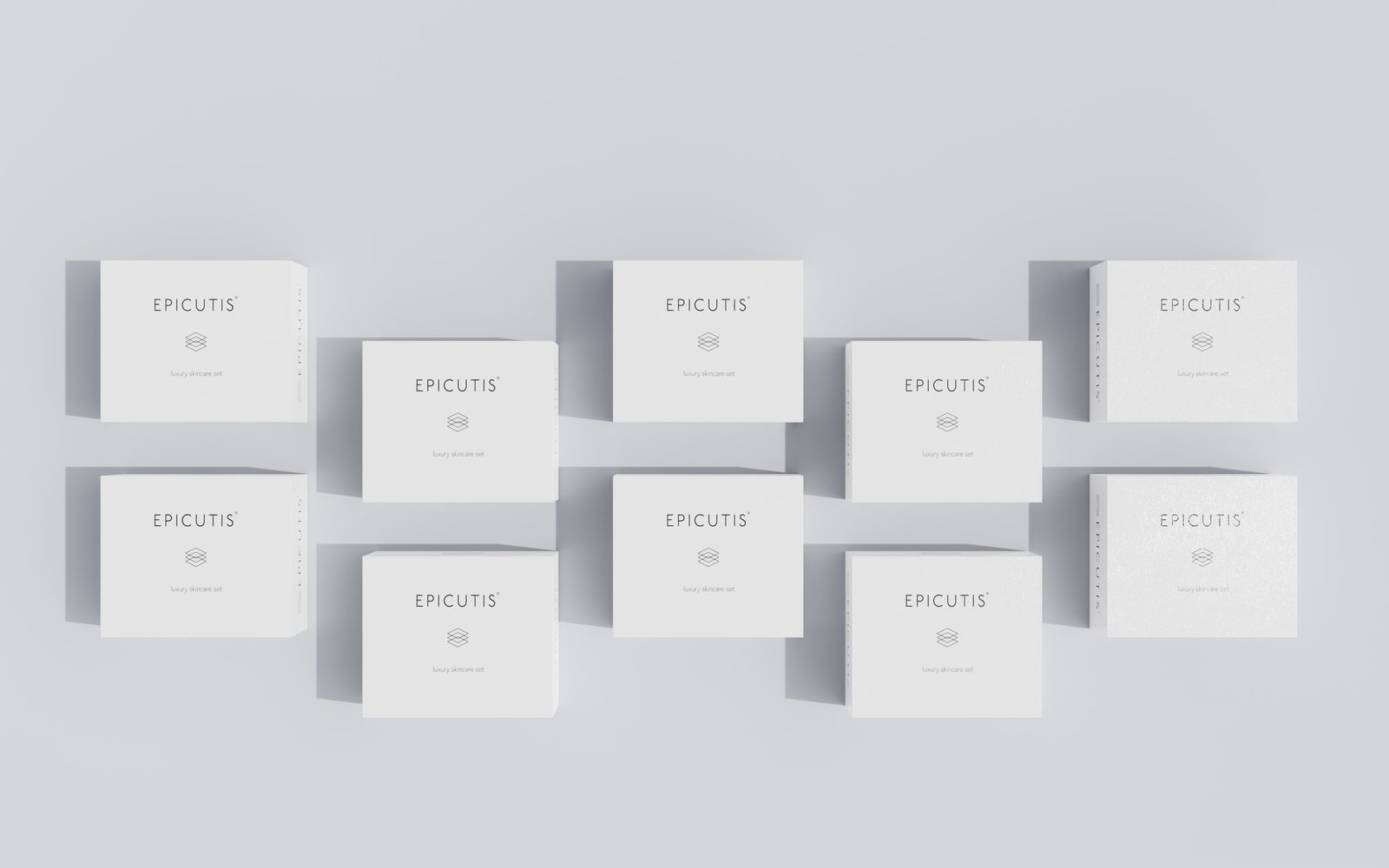
Soft-touch base, foil accent, spot UV detail, deboss anchor — the order and placement is as identifying as the silhouette. Line extensions inherit the stack. They do not reinvent it. A new finish combination on SKU three is how systems quietly fall apart.
- Document the finish stack with substrate, coat weight, and placement for every surface.
- Define acceptable combinations — which finishes stack, which do not.
- Confirm every supplier in the roster can execute the full stack to the written tolerance.
Color flexes — within rules the system owns.
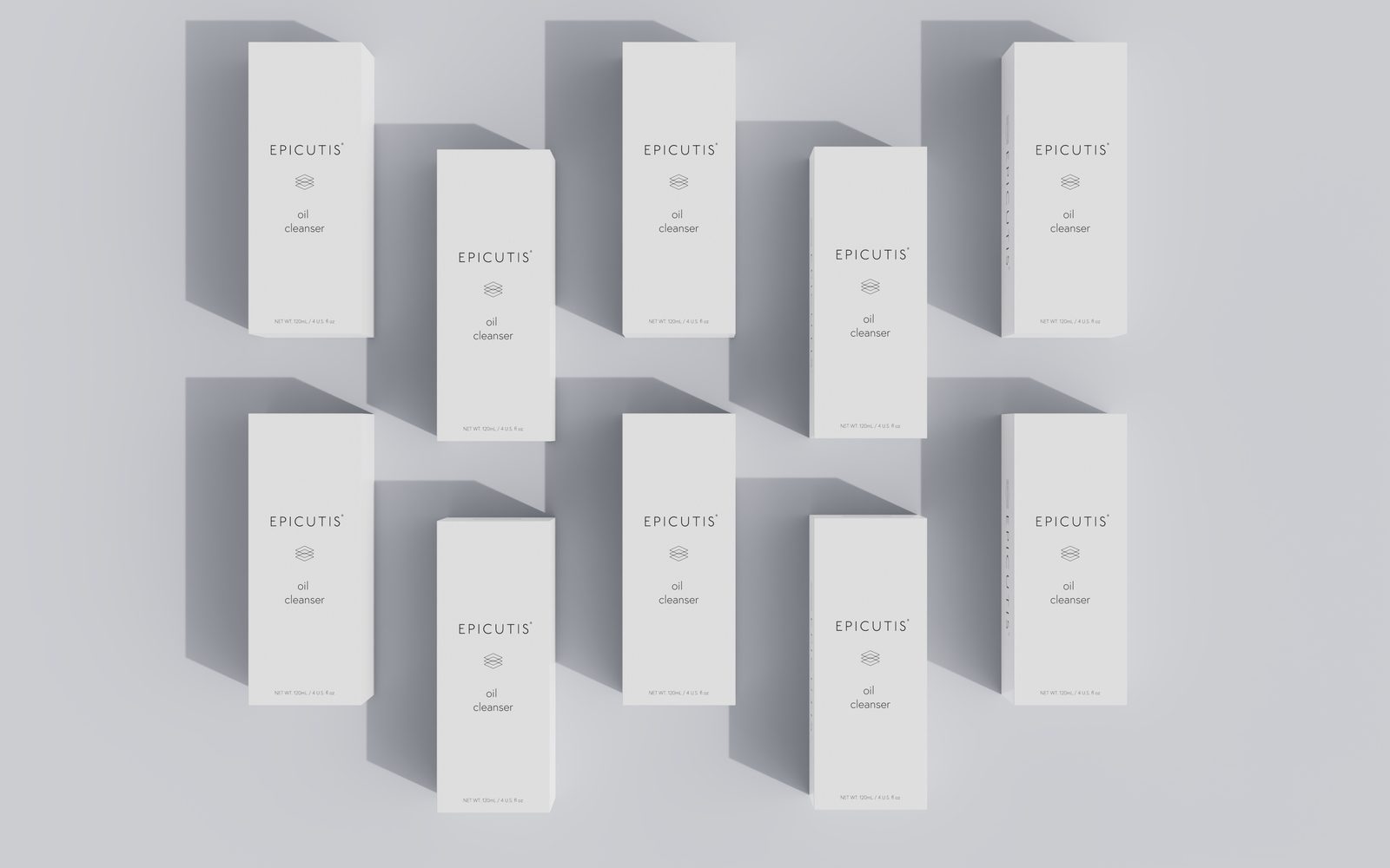
This is where most brands feel pressure to “express the formula.” A color system handles that pressure. The palette is defined. The assignment rules are defined. New SKUs pick from the system — they do not add new colors. The seasonal palette is a controlled extension, not an exit from the system.
- Define a hero palette, a variant palette, and a seasonal palette.
- Specify which panels and components carry color, which stay neutral.
- Approve every new variant against the palette before artwork is briefed.
A gift set is the system in a new container, not a new brand.
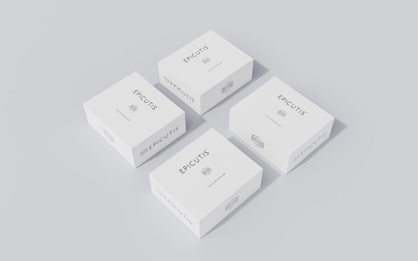
Seasonal, gift, and limited-edition formats are the sharpest test of a system. The temptation is to treat them as design permission slips. The right move is to stack the same silhouette, hierarchy, and finish stack inside a modular secondary architecture that was designed for exactly this moment.
- The gift carton inherits the hero finish stack — soft-touch, foil, spot UV — at scaled proportion.
- The tray holds the SKUs in hierarchy order — hero at the anchor, extensions arranged around it.
- Seasonal color variants come from the system’s approved palette, not an agency brief.
When the rules hold, the line photographs as one object.
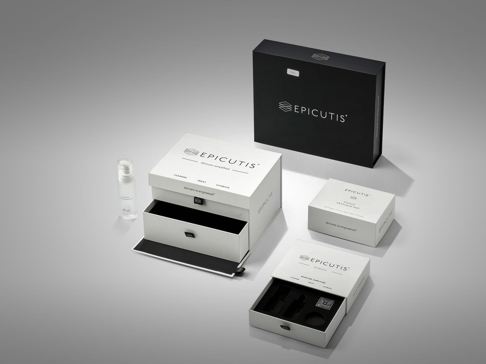
The real test is not the hero shot. It is the family shot — three SKUs, a gift set, and a PR unit arranged on one surface. If that composition reads as one brand without a logo, the system is working. If the eye has to search for the connective tissue, the system is drifting.
- Shoot the family together before the hero shot, not after.
- Review every launch against the family photograph, not against the individual SKU brief.
- If a new SKU breaks the family photo, the SKU goes back — not the system.
04.Hero SKU to line extensions
The hero SKU does not establish the system by shipping. It establishes the system by being the first SKU designed against a written specification that every subsequent SKU will inherit. A line extension that drifts from the hero costs the brand its system; a line extension that holds inherits every system decision the hero paid for.
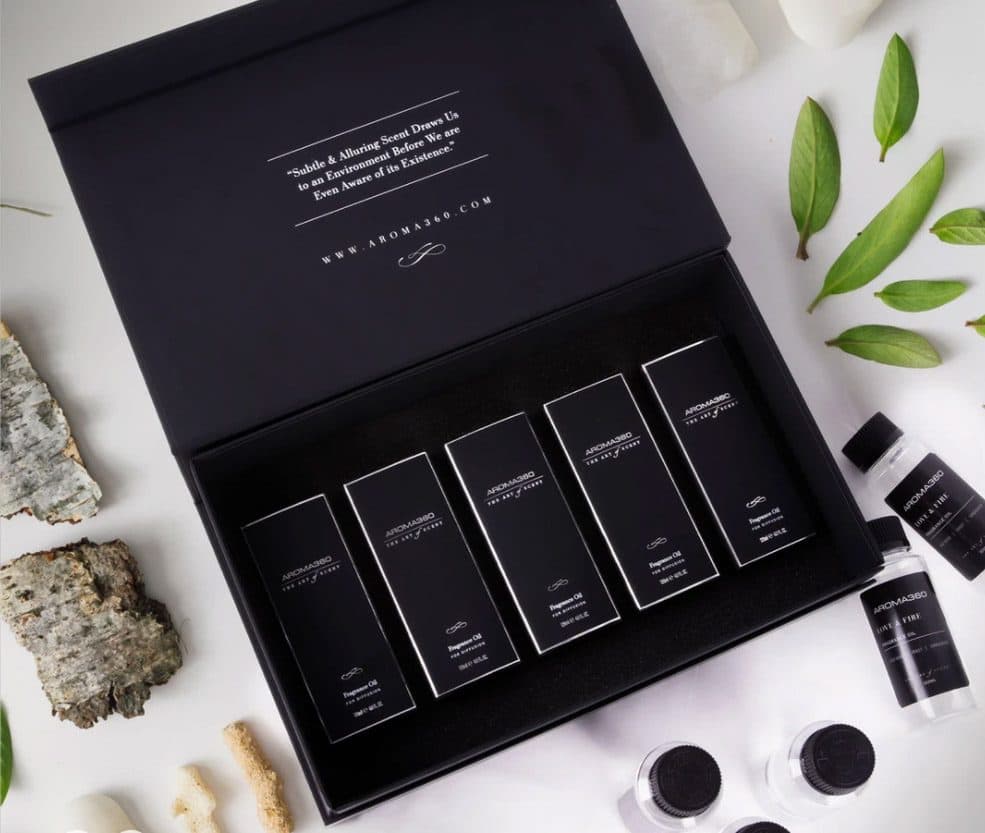
Aroma360 discovery-set architecture — the same system scaled from a single bottle to a multi-SKU gift set without redrawing the brand.
What transfers from hero to line extension:
- Silhouette (sometimes scaled, never redrawn)
- Finish stack (same substrate, same coat weight, same placement rules)
- Typography and lockup (unchanged)
- Supplier roster (unchanged — the extension does not get sourced cheaper)
- Color system (new SKU picks from the approved palette)
What is allowed to flex:
- Dimensional scale (within the hierarchy rules)
- Variant color (within the approved palette)
- Secondary carton proportion (within the modular architecture)
05.Line extensions to gift and seasonal sets
Gift sets and seasonal formats are where most beauty systems fail. The brief arrives late, the agency wants “a holiday moment,” and the easiest answer is to treat the system as a baseline rather than a constraint. The result is a holiday pack that photographs well in isolation and makes the rest of the line look weaker beside it.
A well-constructed system handles this moment by pre-defining the gift architecture. The holiday carton is the system’s secondary architecture at a scaled proportion. The tray carries the hero SKU at the anchor position. The seasonal color comes from the approved palette. Everything the gift set adds — a ribbon, a sticker, a card — is specified as a system extension, not a creative choice.
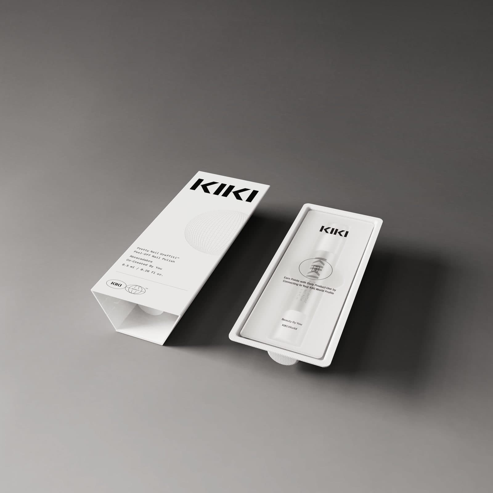
KIKI World secondary packaging — the system that let a launch SKU extend into a Pentawards 2024 shortlisted multi-component kit without a brand redesign.
06.Gift sets to PR and influencer kits
PR mailers and influencer kits are the system’s highest-leverage format and the easiest one to over-design. The question to answer is not “how do we make this unforgettable” — it is “how do we make this unforgettable as this brand.” A PR kit that is unforgettable in a way the rest of the line is not is not a brand moment. It is a one-off.
The Influencer Kit Playbook covers the PR kit discipline in detail. For the design system, the only question that matters is: does the PR kit extend the system or exit it? If the PR kit’s silhouette, hierarchy, finish stack, and color palette all come from the system, it compounds the brand. If any of those are new on the PR kit, the kit is a separate asset and should be judged as one.
07.The rules that fix — and the rules that flex
Fixed rules (the system’s identity)
- Silhouette and its scaled variants. Documented with proportions, radii, and anchor points.
- Hierarchy rules. How height, proportion, and tray position signal hero, support, and extension.
- Finish stack. Substrate, coat weight, placement, and approved combinations.
- Typography and lockup. Brand mark, SKU name treatment, legally required type.
- Supplier roster. The factories that can hold the system to the written specification.
Flexible rules (where variation lives)
- Color. Hero palette, variant palette, seasonal palette — defined, with assignment rules.
- Secondary architecture. Modular carton, tray, insert — scaled to the format.
- Ornament. Ribbon, sticker, insert card — specified at the system level, not improvised per launch.
Bottom line
Most beauty brands do not have a packaging design system. They have a packaging. The brands that scale cleanly — from hero to line extensions to gift sets to PR — build a written system before the second SKU, enforce it through one supplier roster and one owner, and reap the compounding payoff as the line grows. We develop the structural system, write the specification, qualify the suppliers who can hold it, and extend it through every SKU, set, and format the brand ships.
08.The 10-item design system scorecard
Run your current brand through the ten checks below. If more than two or three come back with hesitation, the system is in people’s heads — not in a specification. That is the gap this guide exists to close.
Related guides & references
A design system is the connective tissue across every other packaging decision. These are the guides that each own one layer in detail.
- Luxury Beauty Packaging System — how to design the hero SKU the system will inherit from.
- Beauty Packaging Material Decision Framework — the material layer of the system (silhouette substrate, carton substrate, closure materials).
- Packaging Finish Guide — the finish stack layer in depth: soft-touch, foil, spot UV, deboss, emboss.
- Packaging Brief Template — where the system’s rules get captured so every new SKU inherits them cleanly.
- Packaging Testing & Quality Control — how to verify a new SKU actually matches the system at pilot and production.
- Influencer Kit Playbook — how PR and influencer kits extend the system without exiting it.
- Sustainable Packaging Decision Matrix — when sustainability is a layer in the system vs. an addition to it.
- Epicutis case study — a design system scaled from three SKUs to 21+ with one supplier roster and one spec.
- Artilect packaging reduction — a design system engineered to shed weight without losing the brand.
Quick answers
Common questions brand managers ask when they first consider building a packaging design system across their line. For the deeper layer-by-layer material, finish, and testing detail, start with the related guides above.
Building a Packaging Design System
Scale a beauty line without redesigning the brand every launch.
We develop packaging design systems that hold from hero SKU through line extensions, gift sets, and PR formats — and manage the suppliers, specifications, and QC that keep them honest.